6 Mistakes 99% Of Real Estate Agents Make When Advertising on Facebook (+ Case Study of how the 1% of Top Real Estate Agents do Facebook Differently)
According to Borrell Associates 89% of real estate agencies ad spend went towards online advertising in 2019 – with newspaper ads making up just 4.8%.
Many real estate agencies are advertising on social media. However just because a major real estate agency uses Facebook ads does not mean that they are doing it correctly.
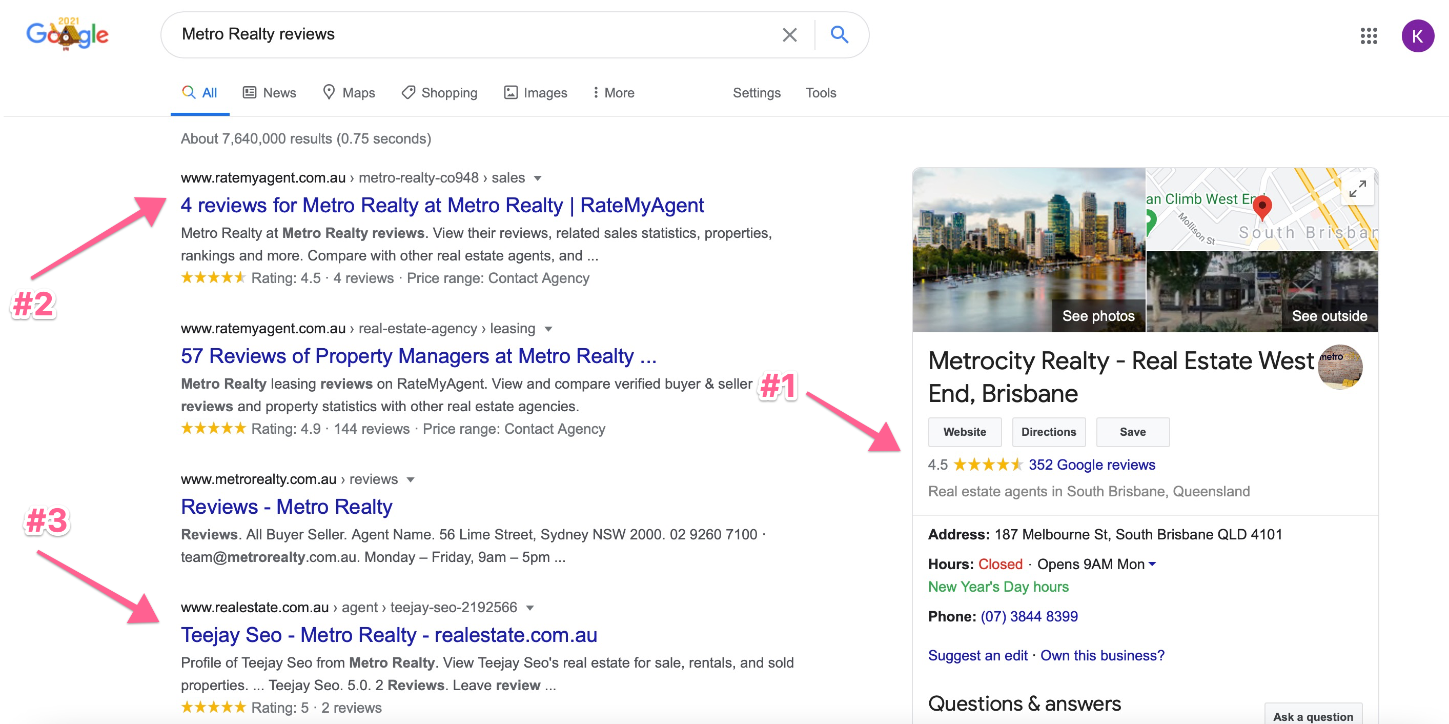
And this is not a guess – I’ve been speaking and auditing Facebook websites and speaking to real agents in Australia and seeing the results they have been coming up with. Many don’t even know how much leads they are receiving because their traditional agencies is pushing stats like views or impressions etc. – after speaking face to face with real estate agents in Australia I have come up with and the truth is after researching and speaking to not only agents but successful advertisers I have come up with cutting edge research – not available anywhere else – where I can show you what is – and what isn’t working when it comes to getting appraisal appointment leads on Facebook in Australia.
By the time you finish watching this blog you will learn the mistakes that 99% of real estate agencies make when they start advertising online – which will help you save tens of thousands of dollars and learn information that even the top Facebook agencies don’t know about when it comes to filling your pipeline with leads.
In the first section I will talk about the biggest mistakes real estate agencies make when advertising on Facebook and in the second section I will give you the full blueprint of not only how to advertise and fill your selling pipeline with leads but also show you how the top 1% of real estate agents are all ready doing this with a real case study.
1. Spy on your Competitors, just don’t assume they know what they’re doing (or that what’s good for the geese is good for the gander)
Facebook’s ad transparency initiative means you are now able to see what ads your competitors are running now and in the past – across Facebook and Instagram.
Do you think if you were looking to start advertising on Facebook it might be a good idea to check out what others have been doing – and what’s worked and what hasn’t worked for them?
Just go to any company’s Facebook page and scroll down to the ‘Page Transparency’ section – click ‘See All’ then scroll down and click ‘Ad Library’ – voila – you know have the Facebook advertising blueprint for some of the biggest real estate companies in Australia.

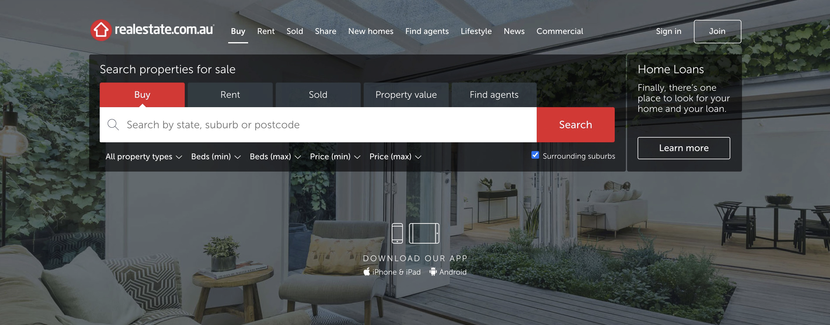
This means you can go to the Facebook page of realestate.com.au – who spends hundreds of thousands on Facebook every year – and find out exactly what ads are working for them right now – or you can go to the biggest real estate agency in your city and see what ads they are running.
Before you start copying or getting inspiration from other real estate company’s ads please keep the following two points in mind:
- Realestate.com.au is not even a real estate agency so their Facebook strategy is going to be completely different to yours – it’s a great place to find ideas but you must understand they have completely different goals – which is not getting property appraisal appointments – which is what you want.
- Just because a successful real estate agency has a Facebook campaign does not mean that they’re successful because of their Facebook campaign. This is a mistake I see a lot of real estate agents make where they’ll come to me and say “Well we want to be like this company and this is their website” – and I say “Their website is horrible – it’s terrible.”
Most of the time when I research this “big and successful” real estate agency I find out the reason for their success usually has to do with their consistent and unrelenting client follow up strategy or some other reason – but in many cases it’s not because of their Facebook campaign.
Some of the biggest real estate agencies that I’ve spoken to have had Facebook campaigns where they didn’t even know how many leads they were getting, the lead acquisition system was completely broken and their advertising agency was pushing numbers on them like “Total Impressions” which means nothing.
2. Stop Treating Facebook Like a Magazine (Because it’s 2021)
News flash – Facebook is not a magazine – yet advertisers are still obsessed with treating it like one. What do I mean?
Well let me ask you this – if you were advertising in the year 2050 in a magazine and you had the option to advertise in a magazine – but you could have a video play on the futuristic paper or have a still image – what would you choose if you had a choice? -and they said to you —
What do you think would grab a user’s attention more? A video – or a still photo?

And what if you were told that both a video and a still photo cost the exact same?
What would you choose?
Now what if you were told that it would cost you $1 for every person that viewed your video and $7 for every person that viewed your still, boring photo.
What sounds like a better investment?
If you think you’d be crazy to not use video – then yeah – you’d be right. And that’s exactly what most companies are doing.
In fact the biteable.com research found that the cost per click on a video ad was $1.19 vs. $7.11 for a static image.
But Facebook doesn’t just have video ads – they have Gallery ads and Instant Experience ads – they make such an effort to give you creativity and stand out – but of course most media agencies whoa are used to advertising in magazines still don’t get it.
“But we don’t have the budget for a commercial” – you may be thinking.
Sure – but do you have 4 images you can put together into a slide show? There are online tools you could use to put this together in as little as 30 minutes – no big Hollywood budget required.
And this is coming from someone who specialised in video production and has been responsible for many commercials – and I can tell you – it’s not necessary.
But how do we use video ads specifically for getting more appraisal appointments – well we’re going to get to that!
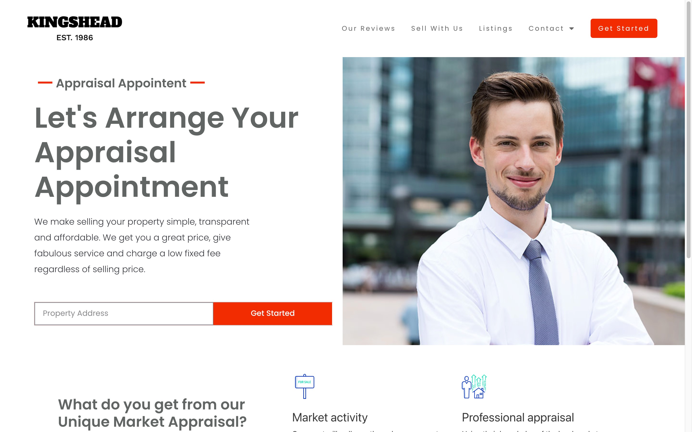
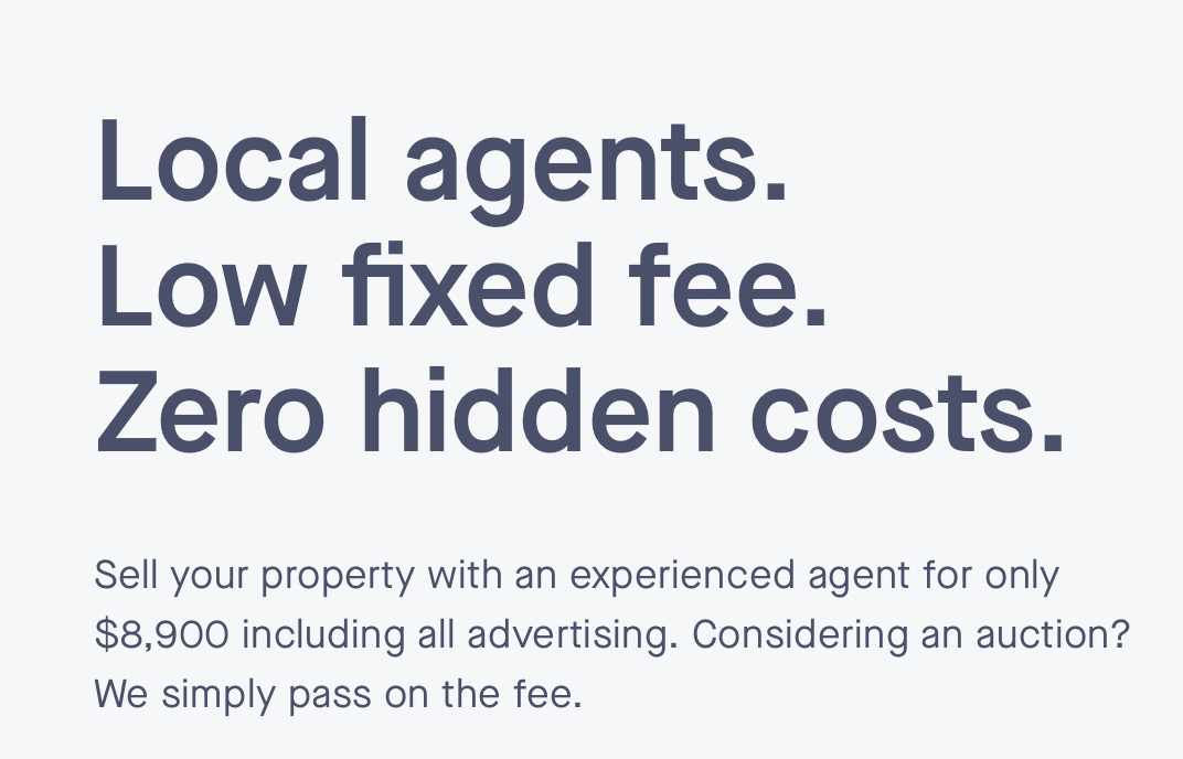
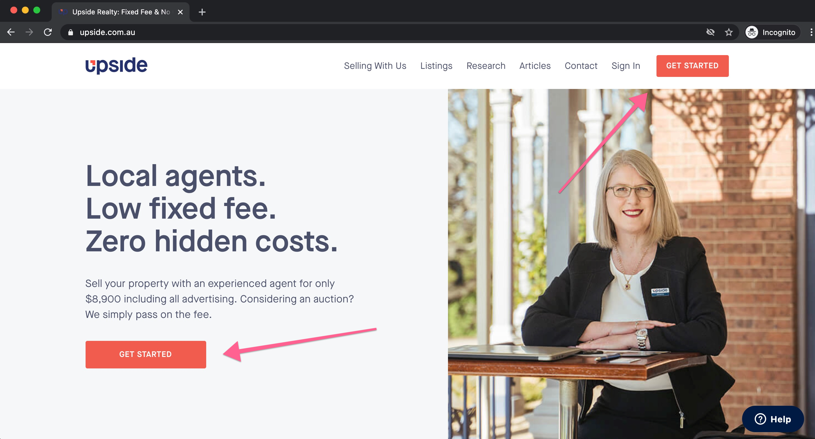
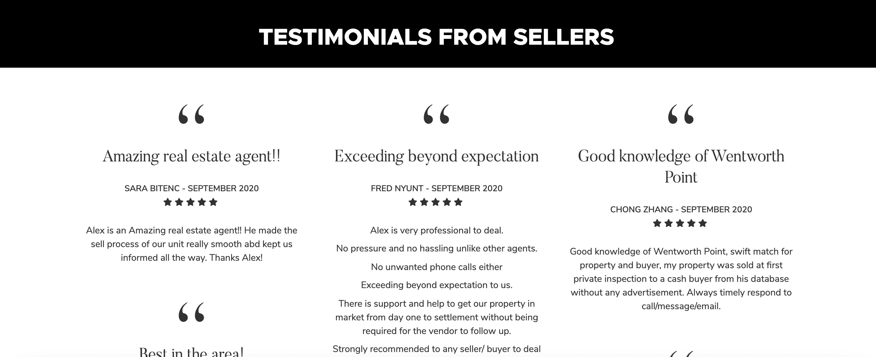
3. Stop Giving “Fake” Value – Start Giving “Real” Localised Value

Since we know that nobody on Facebook cares about your business and only wants what’s relevant to them many companies make the mistake of creating “reports”. You’ve seen these – the 5 tips to sell your home in 2021. The 5 tips on how to manage your property in 2021. Whatever it is.
Long story short – not only do people not care about your business – they also don’t care about reports. The market is flooded right now with information products – especially in the real estate field – and there is a flood and over saturation of this type of content.

Also creating generic reports like this is lessening the value that you can give to your prospects – you need to create content that plays to your competitive advantage.
And what is your competitive advantage? Well if you’re a real estate agency – many real estate agents say they are the “Local experts” – and that’s what your value should demonstrate – not only is this better for the prospect but by doing this you position yourself as the No. 1 choice in your area – not just a great real estate agent.
For example – did you just sell a property in your area that set a record for the highest price, perhaps you’re more of a hands on agent and you did some renovation for your client prior to the sale in the area you serve. Maybe you’re a property manager and were able to significantly increase one of your client’s rental yields – sellers are looking to hear information like this – especially if it’s in the area where they are selling.
And later on in the ‘Blueprint’ section of this blog I’m going to show you exactly how an agent has applied this exact strategy successfully – so stay tuned!
4. Behold the Power of the Emoji
Plain text is boring – and as an advertiser you want to ensure your ads stand out and capture the user’s attention right? How else can you ensure your value proposition is read and connects with your audience?
The problem is unlike others – whose friends are actually interested in what they have to say – very few people are interested in what a company has to say about themselves.
When creating your Facebook ad you want to create engaging content that people will read – but at the same time you know that no one is looking to read an ad when they land – much less a long one.
So when you have a message that’s longer than the typical 6 word Facebook post – on a platform where no one is looking for you to come in and state your piece – how do you ensure that it actually gets read – and stands out?
Well what if I was to tell you that you could do this using a technique that most people on Facebook don’t even use – which is free to use – makes your message be 50% more visible and won’t cost you a cent extra?
Well – here it is. Behold the power of the Emoji!
People LOVE emojis – they can break up your text. What looks better a bunch of bullet points like this?

Or a bunch of bullet points like this?

You can use emojis to make your text powerful and because they’re so rare and so few advertisers use them (because they don’t know about them) – much less people that use Facebook. Emojis – combined with powerful copy targeted at the right prospect will PULL the person into your copy.
You can find a list of all the supported emojis on Facebook using this link
[bit.ly]There are emojis for every need – and I’ll go through how to use emojis for real estate ads specifically on Facebook after this!
5. Don’t Buck the Zuck (Please the Facebook Lord – and Keep People on Facebook)
Mark Zuckerberg is the guy who runs Facebook – and if you want to be successful on Facebook you have to understand Mark’s philosophy on how advertising should work on his platform, how the advertising platform works on a technical level – and understand -how- Mark Zuckerberg’s goals and work within those.
This is what separates those who know how to post an ad on Facebook – and those who make millions of dollars year after year exclusively from Facebook advertising and dominate the competition in their industry – -and I’m going to break down these- – let’s break each one down.Segment your engaged audiences – Mark’s goal with all aspects of his Facebook platform is to ensure that the end user is served with the most relevant content – and that the user keeps scrolling. The longer a Facebook user scrolls on his phone – the more ads Mark Zuckerberg can serve that user – the more that user will come back again and again.
Tracking and Segmenting
Mr. Zuckerberg has created one of the most sophisticated systems to track how engaged a user of his product is with the content his system serves.
We’re not just talking about whether someone clicked on your ad – we’re talking about, did they hover their mouse over your ad, did they click on ‘Read More’. Do you have a video ad?
Well you can see how many people watched it for 5 seconds, for 15 seconds, for 30 seconds – and we can even segment those audiences and say “Let’s show everyone who watched the ad for longer than 30 seconds… another ad!”
Not only do you have access to all this tracking information – but you can build audiences around how engaged prospects were with your ad – and re-target those audiences. For example let’s retarget everyone that wathed 15 seconds or more of your video ad but didn’t get in contact.
This is why it’s so important to start advertising earlier rather than later on Facebook – because even if your campaign is a complete failure – you’re still getting data and are able to build custom audiences of people that at least decided to give your ad a little bit of attention – and then retarget those audiences!
Ad Variations – Utilise Facebook’s AI Machine
You must understand the Facebook AI machine. Facebook doesn’t have ‘editors’ per se – like a magazine – who decide – on a human level what should be shown and what shouldn’t. Instead what is shown on Facebook is determined by the “algorithm” – and those that understand how to work within the algorithm – and give it what it needs are rewarded and win – those that work against it lose tens of thousands of dollars and are run off Facebook.
So what is the secret?
I’m going to tell you now – the secret is – you need to give the algorithm as much data points as possible so it can work with you to optimise your relevancy score. What do I mean? I mean if you have an ad – you can create 5 text variations – and 5 image variations – and combine all the different combinations into 25 separate ads and then let the algorithm do the rest!
Most people just create one ad – sit back and then see it fail and then create another ad and try that. You want to avoid this.
Keep them on Facebook – Messenger Ads
The final way to not buck the Zuck – is to keep people on Facebook and avoid external links! Most ads you see are trying to navigate users away from Facebook to a landing page – however you don’t need to let people leave Facebook to get their details and start a conversation and sell your service – especially if you’re a real estate agent.
Facebook incentivises and rewards advertisers who create ads that keep users on the Facebook platform instead of navigating away from it – and this makes sense of course – the longer people stay on Facebook the better.

But it’s not just a benefit for Facebook – using tools such as ad to Messenger and Lead Ads you can increase the amount of leads you receive by removing the friction that a landing page creates. This is because instead of getting the user to type in all their details – their name, phone number etc. you can have Facebook pre-populate this information for you – and the less your prospect has to work the more likely you are to receive more information.
Oh – and if you get someone to get in contact with you through a Messenger ad you don’t just get their name or email – you get their life! You can do all kinds of research on the prospect before you even reach out to them – this is all valuable information for follow up – so take advantage of this!
6. Put Yourself Last, But Do Put Yourself – and Give the Deets
Many companies start their advertising talking about themselves and (obviously) – how great they are. They go about this in different ways but more or less the message is always similar – we are amazing – you should definitely work with us – we will do the best job possible.
The problem is there’s nothing you can really say in this regard – about your company that will be taken seriously or be welcomed. People on Facebook are not looking to learn more about your business.
But no matter what you say – or what value you can give outside of saying “We’re awesome” – you are going to have to say who you are – because that’s going to show as your profile when you post an ad – so when you do mention yourself you need to do these two things to avoid the most common mistake real estate agents make.
Firstly – put your phone number in the ad! Facebook has no policy against having your phone number in the ad itself – forget about your big flashy logo and instead include a phone number.
And – secondly when you do mention yourself make sure you include a photo of the actual agent or person inside your company. Make it personal. I see a lot of ads by real estate agencies where they have a photo of some building and then their logo in the bottom right hand corner – listen nobody cares about your logo or a building or house – unless it benefits them.
However if you are going to include info about yourself then make sure you give a direct mobile number at least – so people know how to call a REAL person.
Again – I want to stress this – nobody is impressed by big logos or big brands saying how big and important they are on Facebook. You’re pretty much the company equivalent of the guy who posts on Facebook to say how he has too many friends and he’s about to unfriend some – it comes off as douchy and does not fit the culture of what Facebook is.
Keep in mind I’m talking about leads – some may say this is not the best way to build a “brand” but you’re not on Facebook to build a brand – you’re on Facebook to get leads and position yourself afterwards.
Now I’m going to show you how to put all these tacts in the next section.
Practical Case Study: Behind the Scenes of a Successful Facebook Ad Strategy – How the 1% of Real Estate Agents Do it Differently
So now – hearing what works and what doesn’t is great. But let’s actually go behind the scenes of an agent who is putting all of these strategies together and is making a killing on Facebook.
Anyway let’s go through the anatomy of a successful ad.
Let’s look at 2 ad variations so we can figure out why they work:
Ad Variation #1:

Now why is this ad so great? Let’s see how it conforms to the model that we discussed:
Emoji Time
You can see the finger used for the bullet points. This is eye catching and creates a more friendlier and casual outlook – much more than these big blocks of text that nobody is going to read.
Also you’ll notice that there’s really no big block of text. The ad is getting straight to the point – with a real estate agent you don’t need to have a ten page story – people get the idea – you sell homes.
Real Localised Value
Here the agent Remy is showing the prospect what was achieved with a home that was just sold and offering to show them the price if they click ‘Learn More’. You’ll also see there’s a street name and a suburb name – now imagine if you live in this area – this agent has positioned himself perfectly, very quickly with numbered statistics – which is always important – he didn’t start with “I’m a great agent that’s focused on results” – he gave numbers – and numbers on a very specific piece of property.

Now the value here comes in because imagine you live in this area and you see this property sold on Cambridge Street – you’re going to say “Oh, I know that street – that’s just up the road right? I’m curious how much that property sold for – sure let me know.”
This is localised value – people want to know what homes sell for. He didn’t give out a report like “How to sell properties for more” or anything else – he’s giving unique knowledge that only he has – there’s no one who is looking to sell their home who is not curious about how much other homes are selling for – and this is very fresh information.
Notice the agent says “just sold” – in other words this information is probably not even in the public registrar yet. It’s fresh!
Facebook is not a Magazine Concept
Not using Facebook as a magazine – in this case this agent Remy could have just used a single photo but he didn’t – because Facebook is NOT a magazine. You’ll notice he used an image gallery ad – and he uses an identical ad but uses a video instead – here is the ad with the video:
Now you’ll notice in this ad the creative and even the images used are exactly the same – the only difference is that in this case rather than using an image gallery ad Remy has taken the gallery and used a simple video program to create a video that cycles through the images – by the way – lots of tools online to do this – it’s not that hard – you don’t need a professional sales team.
The reason this is smart on Remy’s part is that he is feeding the Facebook algorithm with different variations of his ad and allowing the algorithm to determine which ad to use and when to optimise his results – which in this case is to get people to start a conversation by clicking ‘Learn More’.
Putting yourself last


You’ll notice in the video at the very end Remy puts his personal details including his mobile number – and he does this in the second to last ad on the Gallery. This is a great way to get those direct calls – I can imagine myself saying “You know what let me call this agent direct and ask him how much that price is” – and once your ad has opened up that conversation your Facebook ad campaign has done its job – now it’s your ob as an agent to either book an appointment, call back or start a follow up sequence.
By the way I can tell you that with this type of ad you’re going to get enquiries from people who may not be looking to sell their home for another 6 months – you may even get enquiries from just curious people – but you’re going to be casting the largest possible net.
When you start an ad – as a real estate agent with something like “Look at how amazing we are, we can sell your home, we are the local experts” or whatever generic thing you want to say the only enquiries you’re going to get are people who are looking to sell their home right now – if someone is looking to sell their home later they may raise their eyebrow and consider you in the future – the old “awareness” and “top of mind” that many advertisers talk about – but I’m sure you’d rather be creating contact with these people and having a follow up strategy – because there’s no better way to stay top of mind then actually speaking to someone and calling them back.
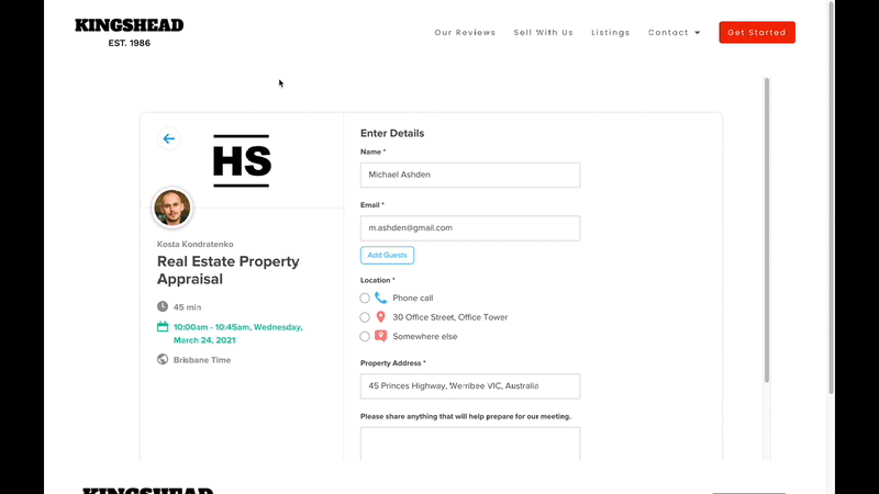
Click to Messenger Ad

Finally I want to stress – and this is not shown in my demonstrations but this ad is a ‘Click to Messenger Ads’ – which means that when someone clicks on ‘Learn More’ they start a conversation with the company through Messenger and are taken through a multi step questionnaire to qualify themselves as a valuable lead.
If you are a real estate agent – stop using landing pages. An ad to messenger allows you to get all the information you need from a client and also allows the client to autatomically fill in details like their phone number and email with one click – eliminating friction in your lead generation process.
Also you can see when your prospect has read your message and you can easily follow them up with new information as necessary and keep yourself top of mind – but really you should be getting on the phone with the prospect as soon as possible!
Summary
In this blog I went over the most common mistakes that you see real estate agencies making – along with how to fix those problems – and finally we ended with a real case study of an agent that is getting extremely good results from Facebook – and I know this from first hand knowledge.
This blog should be the blue print for your online strategy when it comes to generating seller leads on Facebook. While the strategies outlined in this blog work great for appraisal appointments the same principles apply for property management leads – just remember – real localised value is the key!
My hope is that I’ve given you some ideas, inspiration and confidence to try this yourself – and remember take action on these concepts. Go and advertise on Facebook. Even if you spend just $1,000 – there’s no minimum ad spend on Facebook.
You can get started for as little as $50 – all though don’t expect big results for that – but the moral of the story is take action because every month you don’t advertise on Facebook is another month you are losing data with what works and what doesn’t work – as well as another month you fail to build a custom audience of your future customers.