Technical problems on real estate websites make your real estate agency look cheap and incompetent.
Clients can forgive a website that is not flashy – but when things are broken that will reflect on how users see your brand – just like a dirty or unkempt office, arriving late to an appointment or unfriendly staff – technical issues add up to contributing to a prospect choosing not to do business with you.
Unlike a dirty office or unfriendly staff though – you will never even know they are the cause of lost business because clients will click away without a word.
Technical issues always boil down to 5 things –
- slow websites caused by sliders
- missing security certificates
- incomplete tags
- broken headers
- broken forms
Unlike in person – on the internet there is nothing stopping a client from clicking away from your website and heading over to a competitor – there is no objection handling to be done – you will not even know you were being considered in the first place.
1. Big Sliders and Little Big Images (Slow Websites)
Website speed is more than just not making the client wait around for your website to load – much more importantly it directly affects your Google rankings.
Fixing slow websites have led to an increase of 36% for clients I have worked with.
Kosta Kondratenko
Most real estate companies don’t audit and test their website speed during handoff from a developer and actually believe their website performs generally well without being aware of just how much optimisation potential there is and the different it’ll make to their organic traffic and user experience.
There are two main reasons for a slow real estate website –
- un-necessary sliders and
- unoptimised property images
Un-necessary sliders
Many real estate sites have a slider at the top of their homepage with up to 7 images – all of which need to be loaded before the website can be displayed.
Sliders also offer no practical benefit because no customer is going to sit through a website slider – the attention span of the typical prospects is less than 3 seconds. They either click and scroll to what they’re looking to achieve – or they leave.

Finally sliders decrease your appraisal appointment booking rates because they diffuse the focus and give the client too many options to click on – leading the prospect to become overwhelmed and taking them off the critical path to become a customer.
Sliders also decrease the amount of leads your website receives because they diffuse the focus and give the client too many options to click on – which means you lose the critical path that the user needs to take to become a customer.
Unoptimised Property Images
Many ‘properties recently sold’ or ‘recently listed’ sections on real estate websites can contain many listings and the images for these listings are not optimised – instead they load the large version of the property listing images which is the equivalent of loading all your real estate listings at once.
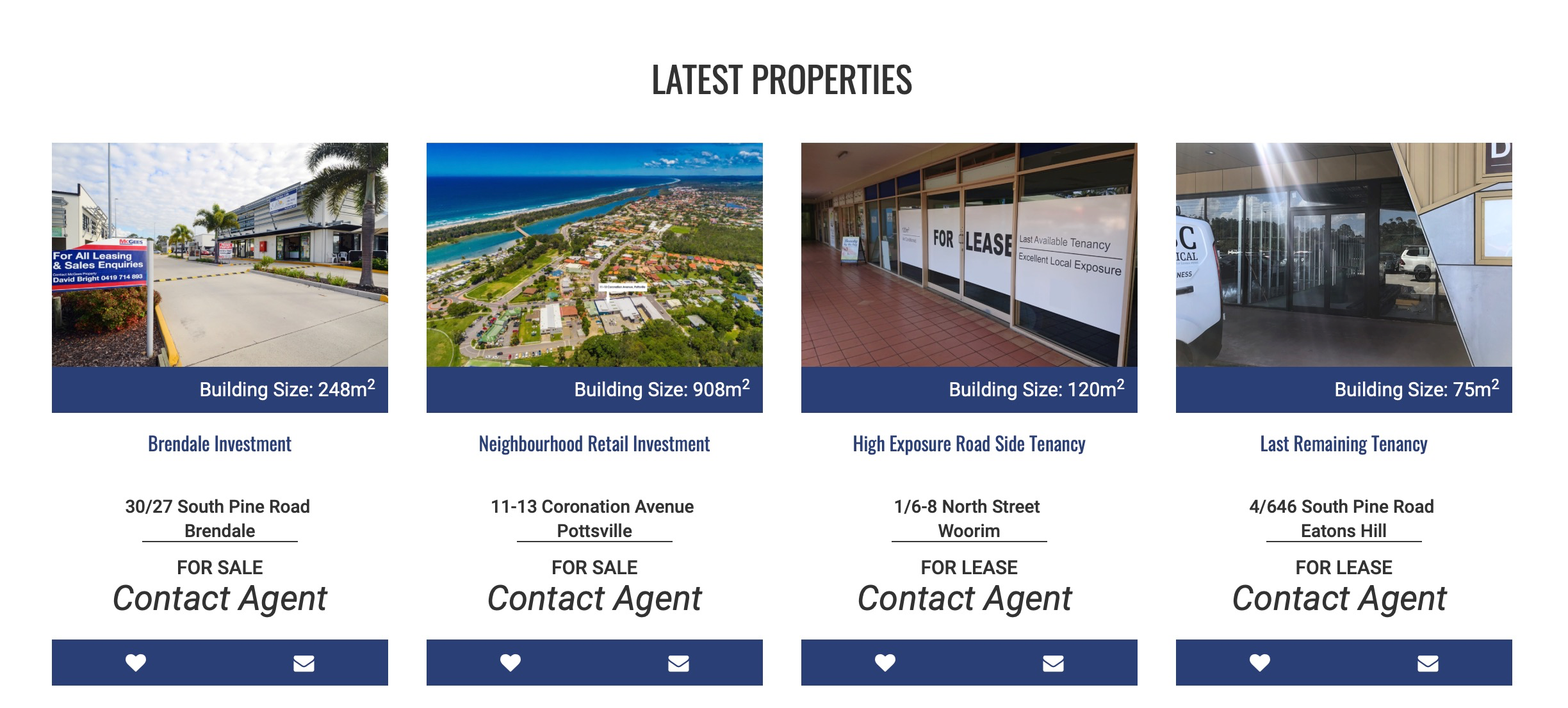
Clients with slower or mobile connections will have to wait longer for your home page to load and Google will penalise and put your site at the bottom of results if you have unoptimised thumbnail images.
2. Missing Security Certificates
Security certificates (also known as SSL Certificates) allow your browser to certify that a website is safe. These security certificates are responsible for putting a green padlock or ‘Not Secure’ message in your browser address bar.

So how do you think the client will feel when they come across a website like this.
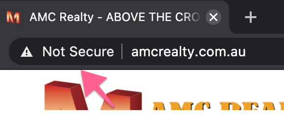
While the client may not know what an SSL certificate is or what it means – it just makes your brand look cheap. If the first thing you see before your business name is ‘Not Secure’ what kind of first impression are you building with the client?
When your prospect sees ‘Not Secure’ as the first thing when landing on your homepage you immediately start off on the wrong foot and lose their trust.
The good news is you can easily fix this issue by calling your reputable website hosting company and getting an SSL certificate installed for free.
If your hosting provider attempts to charge you for an SSL then that should be a red flag – as most reputable hosts provide one for free these days.
3. Incomplete Google tags
Missing title and description tags destroy your brand message and makes you look unprofessional on your Google listings when prospects are searching for you on Google.
Even if you can appear in a prospect’s relevant search results your brand will be devalued immediately and will lead to low confidence in the prospect’s belief that you can sell their home.
How can you sell a prospect’s home using the internet when you can’t make your listing appear properly on Google?
Below is an example of a real estate’s Google listing when no Google tags are present.
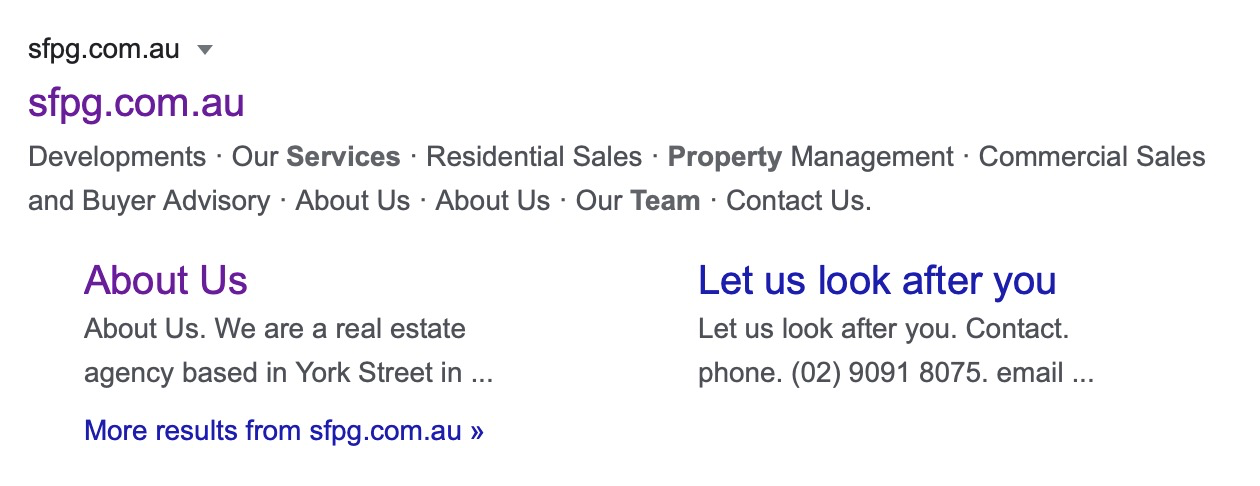
The example above is a real estate’s Google listing when no Google tags are present. The two issues with this Google listing are:
- No Title – since there is no title tag on the website Google defaults to having the website’s URL again -in the title-. Not good – in fact it’s no coincidence that this company doesn’t come up for their own branded keyword.
- No Description – underneath the title you can see Google lifts the top menu text – this is because the website has no description tag – which Google looks for first to find out what it should put in the description field on its search results.
If you don’t have this description tag then it’s up to Google to choose what to show there – and Google doesn’t always make the best decision in these matters. In this case Google just shows the first readable text it sees – which happens to be the menu items since menus are usually the first text that a website renders.
ou wouldn’t create a mailbox drop with just your website URL and a list of menu items as that would make a horrible impression – so why do it on your Google listing?

The important thing is that when clients search for you on Google that it looks correct and is not broken and leaving a bad first impression.
4. Headers – Broken Menus and Humongous Spacers

The two most common issues with real estate website headers are being too big and having unexpected and confusing navigation.

It’s frustrating for the user to navigate your website and find the information they need when an un-necessarily large header is in their way – which leads to the client being annoyed by your brand.
The other issue to do with headers is unexpected and confusing navigation.

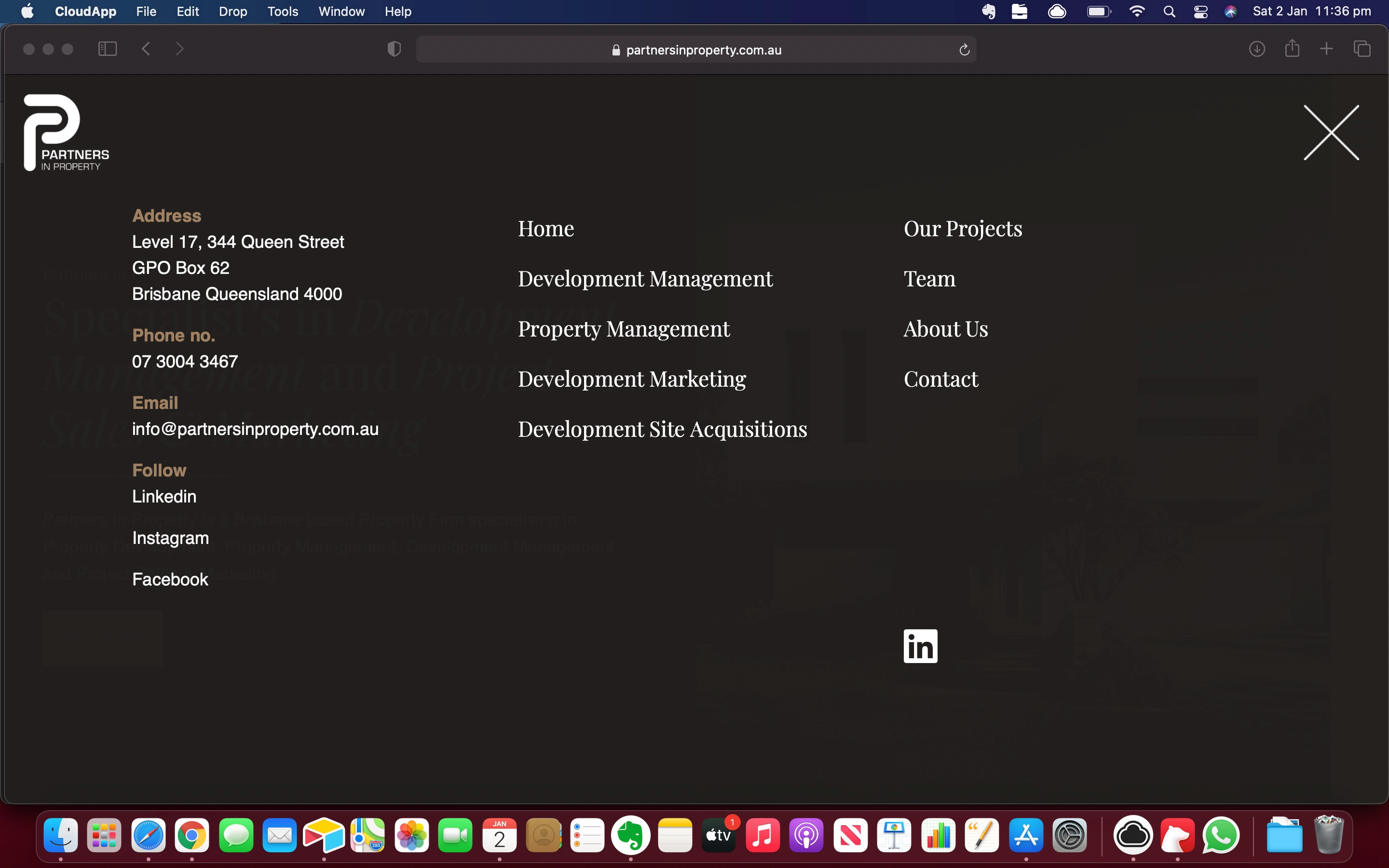
Do not arrange your website navigation in unconventional ways – for example by having the user need to click a navigation button to view the menu like in the example above.
Attempting to be artistic by differentiating your navigation only adds to prospect’s confusion – and leads to prospects having difficulty in finding the information they are after – which is the last thing you want and leads to prospects being annoyed with your brand.
Difficult navigation usually happens when companies try to arrange their menus in a non conventional way. Perhaps due to inexperience or artistic reasons they try to make headers different from everyone else.
Unfortunately this is the type of differentiation that you DO NOT want for your company.
On a website you should have items in places where people expect for ease of use and to avoid confusion. The last thing you want is for people to not be able to find the information they want because they’re confused about where to go.
A common issue I see is menus like in the example above where the user has to click a navigation button to view the menu. Other times a whole section of menu items are hidden unless the user does something to reveal them – you must never underestimate how easy it is for prospects to get confused by your navigation.
Even if the prospect figures out how to use your menu they are all ready in a state of annoyance (and perhaps feeling a little stupid) that they couldn’t find what they were looking for – and everything you say will be tainted by this.
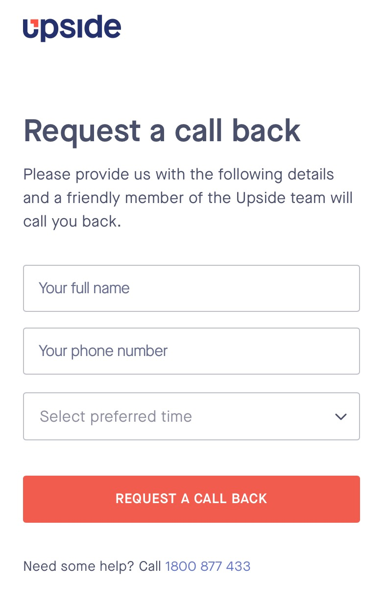
5. The Hidden Broken Form
Forms are essential in moving the client to the next stage of listing their home with you.
The two main technical issues that I see with online real estate forms that stop this from happening are
- Non-asynchronous form processing and
- Non-required fields
An asynchronous form is able to process the client’s inputs with minimum delay and not having to reload the page. This makes the form quicker to process and provides a better user experience.

The second issue is required fields. A non required field in a form means an input that is not necessary to complete in order to submit the form.
When you don’t make certain fields required – like a phone number for example – this sinks your conversion rates because now prospects can send you questions without giving you their contact number which makes it impossible to follow up with the prospect to qualify them and move them to the next stage.
The three required fields you should always ask the client are:
- Their phone number
- Their property address
- When they plan to sell
If a client is unwilling to leave you the following information they are unlikely to list their home with you either.
Summary
Slow websites, missing security certificates, unoptimised forms and broken menus are the most common real estate technical issues.
Fixing these issues will allow you to increase your appraisal bookings and charge higher commissions – as you will be seen as a premium service and a company that is easy to deal with – after all if your website is a breeze to use then your ability to hunt down home buyers and sell your prospect’s home must be just as efficient.