Increasing Conversion by 400% using an Elementor Landing Page
In this blog post i wanted to talk about a recent Facebook Ad Campaign I did for a Guesthouse – and how I used Elementor to update a landing page and increase conversions by 500%. This may seem difficult to believe but I wanted to clarify a few things.
Firstly when I speak conversion rate I’m talking about the following metrics:
- Number of people who engaged with the booking app
- Number of people who initiated a checkout (which is actually putting sample dates in the booking app to see availability)
The booking app that was used is CheckFront – all though the actual booking app that is used – if you are promoting a guesthouse/hotel/hostel is irrelevant – as long as it is built to be integrated with Facebook Events.
By having the booking app that you use be integrated with Facebook you can then track the results by seeing how many interactions happen for each user and being able to track what kind of results happen from modifying certain aspects of the page using split testing.
In this case let’s use an example of the old landing page and the new landing page that was built with Elementor to get it all out of the way first:
Here is the old landing page:

And here is the new landing page created with Elementor that got a 400% positive response rate:

By the way interestingly enough the first time I ran a split test between the old landing page and the new landing page the CheckFront app had broken and was not registering Events – so I couldn’t track the results too well – however after getting in contact with them and informing them of the issue they promptly fixed it.
Below are the results for the split test that was ran on Facebook Ads:

Now keep in mind a couple of things – the first being that there are less impressions/click on the old landing page than the new (the targeting and ad copy are exactly the same for the two ad sets – it’s only the destination page that is different) – the reason for this is because the old landing page ad set started delivering AFTER the new landing page was launched – probably because I didn’t set some option correctly leading it to not be approved.
The other issue is that the new landing page was performing so well I didn’t see a need to continue the old landing page campaign to completion of its budget.
There were 111 clicks on the new landing page and 58 clicks on the old landing page. As you can see even if you double the results of the old landing page the new landing page outperforms it by far.
For example 4 Website Content Views (this is someone engaging with the booking app) – doubled would make 8 Website Content Views – compared to 35 Website Content Views on the new landing page. At 400% increase from 8 that would still be 32 – less than the 35.
As far as the Checkouts Initiated go – you can see we have 5 vs. 0 on the old landing page – in the past when I ran the old landing page campaign my results were pretty dismal for add to carts – having 5 is very good. Basically there is about a 12% conversion of people who engage with the booking app – and those that actually begin the checkout.
You can check out both landing pages using the link below:
http://bit.ly/2Qa7XVE – Old Landing Page
http://bit.ly/2DDTcnn – New Landing Page
So in saying that I’ll make some comments about what worked for me and what I learned from this conversion increase that you may be able to apply to yourself:
Have a Straight Anchor Call to Action
For guest houses/hostels especially – if you have a booking page – allow the user to immediately click and go to the booking section of that page instead of having to scroll down. You will find on the new landing page I have a button that says ‘Book Now’ I made this an Anchor link that takes the user past all the content and immediately to the booking section.
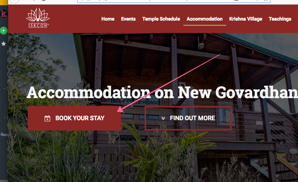
This may not work for all industries – but many times people are going to want to check the prices right away – why force them to go through a bunch of copy? It’s only going to annoy them – on the internet you can’t really hide the price – for commodity based products allowing users to go straight to purchase would be the go.
An Image is Worth a Thousand Words
This is not something I need to tell most people – but make sure your images work and that you have plenty. In the old landing page the images would consistently break – there were times when I would click on the images and they wouldn’t come up – or I would click on the images and the whole page would have to refresh to display that image.
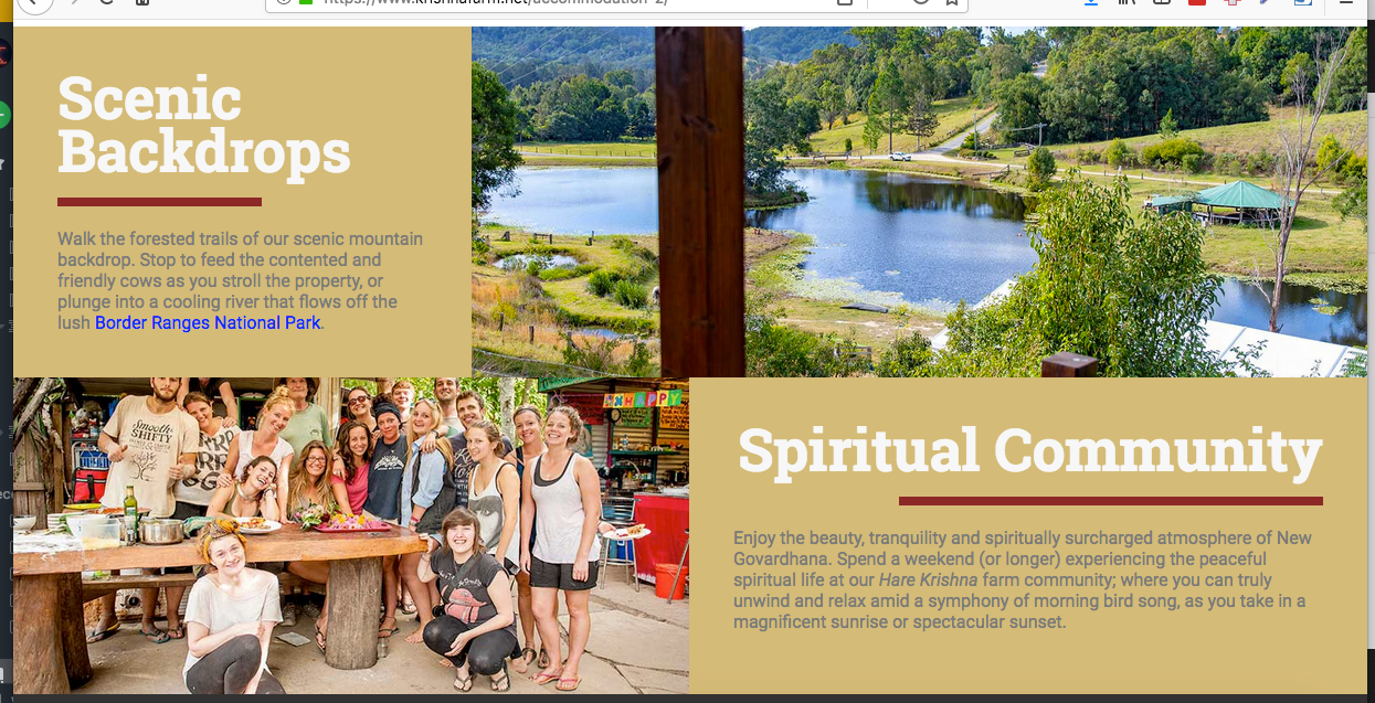
The great thing about Elementor is adding an image gallery is easy – and you will notice on the new landing page I have image galleries for cabins and rooms.
Also I’ve added images for features/benefits of the accommodation stay – along with images for those:
Remove Un-necessary content
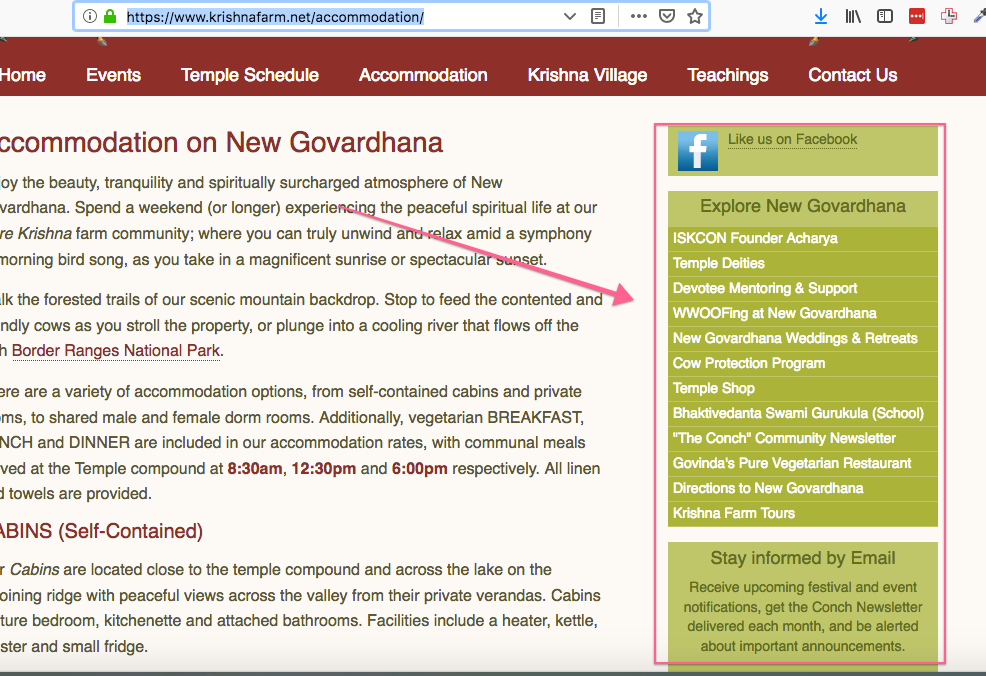
In the old landing page you’ll notice that there is a bar on the right with some unrelated content – this was taking up valuable real estate which could have been used to push the product and so I removed this.
Remove header real estate
In the old landing page the header was quite large – as you can see:
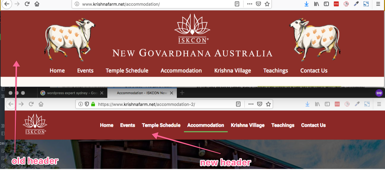
In the new landing page I had created a much smaller header. It could be argued I could have done away with the header completely but I still wanted users to explore the rest of the site. If you check the site now you’ll notice that the only page that has the new header is the Accommodation page – so I basically implemented my Elementor page on the Accommodation page only.
In later blog posts I might share the ad copy and the video I created for this ad – but hopefully this is of value to people. I have attempted to be as transparent as possible – and I believe real case studies rather than theory pieces is the best way to learn and get insight.
Peace Y
Leave a Reply
Want to join the discussion?Feel free to contribute!